
5 Best Data Quality Tools You Should Know in 2022
Businesses today are more dependent on data than ever before. According to Gartner’s latest data quality market survey, those poor data quality can cost businesses an average of $15 million a year. And erroneous data can often lead to lost business opportunities, damaged market reputations, lower customer confidence, and even significant financial losses. It goes without saying that only accurate, consistent, complete, and reliable data can truly deliver real, beneficial value to a business. To this end, many companies tend to use data quality related tools. In this article, we will introduce the following 5 best data quality tools:
- Great Expectations
- Spectacles
- Datafold
- Dbt
- Evidently

Before delving into these tools, let’s first take a look at the concepts associated with ensuring data quality.
Where do data problems come from?
Broadly speaking, both internal and external factors can cause data quality problems. Among them, external factors refer to the data obtained by enterprises from third parties beyond their control, such as Meta, Google Analytics or AWS Data Exchange. For example, the IT systems of different companies may require data integration after a merger or acquisition. However, failure to audit the quality of these data from third parties, or due to poor input validation in the application, can lead to data quality issues.
Internal reasons, on the other hand, arise from within the enterprise ecosystem. For example, we often hear about enterprise data silos, which are some of the lesser-known data sources. They are only used by certain teams or departments within an organization. In addition, lack of proper data ownership management, using the wrong data types and models, or even software engineers changing fields at any layer of the application, or introducing code updates that break data can lead to poor and inconsistent data quality.
How to measure data quality?
The quality and value of data in an enterprise depends largely on how the enterprise defines and prioritizes them. In general, we have seven useful quality measures.
- Relevance: How relevant the data is to the business.
- Accuracy: How precise the data is.
- Integrity: Whether the data is complete and in a stable state.
- Consistency: Whether data is consistent across the organization. If the same application is used to transform the same piece of data from multiple sources, the output should always be the same.
- Compliance: Does the data conform to the standards and formats expected by business rules.
- Uniqueness: Whether multiple copies of the same data are available in the enterprise, and whether it comes from a single source of truth.
- Timeliness: The timeliness of data for current business needs.
How to ensure data quality?
As mentioned earlier, companies often use some automated tools to check the quality of their data. These tools can either be custom developed or provided directly by the vendor. Both options have pros and cons.
If you have sufficient IT resources and clearly define data quality requirements, companies can consider adopting customized development solutions to reduce ongoing costs by launching tools that suit them. Of course, building a custom solution can also be time-consuming and easily exceed the initial budget.
And if a company needs a fast, reliable solution and doesn’t want to maintain it themselves, buying an off-the-shelf solution is the best option. Having said that, let’s discuss five typical data quality tools. Of course, there are many other similar tools on the market. You can choose to mix and match to suit your budget and real-world usage.
Best Data Quality Tools – 1. Great Expectations
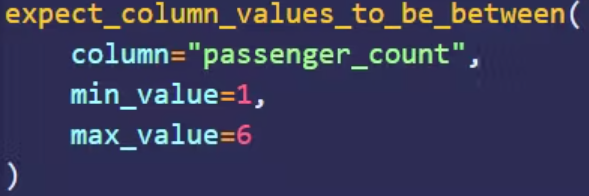
As an open source library, Great Expectations can be used to validate, log, and analyze data. Users define assertions in the form of expectations. As the name suggests, expectations are the quality you expect from your data; assertions are written in a declarative language. For example, the assertion example in the figure below defines that the value of the passenger_count column must be between 1 and 6.
Another feature of Great Expectations is automated data analysis. It can automatically generate expectations from data based on statistics. Significant savings in development time as data quality engineers do not have to write assertions from scratch.
Once the various expectations are in place, they can be incorporated into the data pipeline. For example, in Apache Airflow, the data validation step can be defined as a checkpoint script using BashOperator. It triggers appropriate quality checks as data flows through the pipeline. Currently, Great Expectations is compatible with most data sources, including CSV files, SQL databases, Spark DataFrames, and Pandas, among others.
Best Data Quality Tools – 2. Spectacles
Spectacles is a continuous integration (CI) type tool designed to validate LookML in a project. LookML here is a Looker type of data modeling language. And Looker is a BI (Business Intelligence) platform that allows those who do not understand SQL to analyze and visualize data.
Spectacles validates LookML by running SQL queries in the background and checking for errors. It can integrate with GitHub, GitLab and Azure DevOps. The tool is suitable for manual invocation, triggering from pull requests, running as part of an ETL job, etc., for almost any type of deployment mode. Having Spectacles as part of the CI/CD workflow means it can automatically validate LookML related queries before deploying the code to production.
Best Data Quality Tools – 3. Datafold
As an active data quality platform, Datafold consists of three main components: Data Diff, Data Catalog with column-level lineage, and Data Monitoring.
Data Diff allows you to compare two datasets (e.g. dev and prod) before merging into production. This helps users adopt a more proactive development strategy. It can also be integrated into a team’s CI/CD pipeline to share code changes in GitHub or GitLab and show specific differences.
Let’s look at an example, Datafold’s sandbox environment comes with a dataset of taxi_trips. As shown in the figure below, we ran a Data Diff operation between the datasets datadiff-demo.public.taxi_trips and datadiff-demo.dev.taxi_trips.
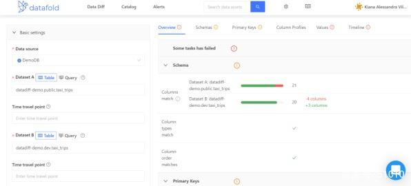
Then on the right panel with details, you will be able to select different tabs to get different perspectives on the results. Among them, the “Overview” tab will contain a summary of the successful and failed tests.
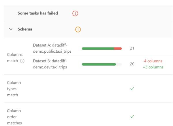
The Schema section shows whether the columns of the two datasets (including data types, and the order in which they appear) match.
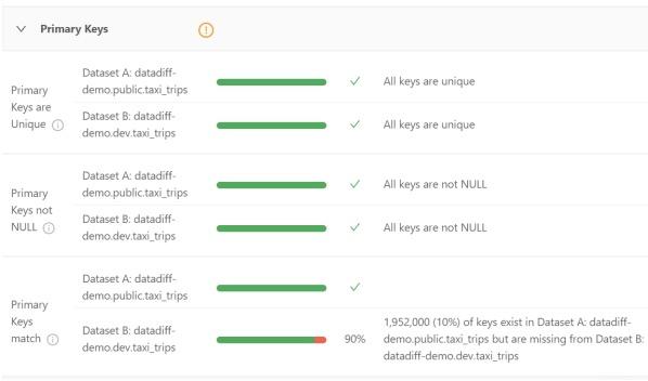
Its Primary Keys section shows the uniqueness of the primary key, non-NULL, and the percentage of matches between the two datasets.
While the Overview tab is well-placed to showcase various sources of information, the other tabs also provide more useful details. For example, the Schemas tab contains the following areas:
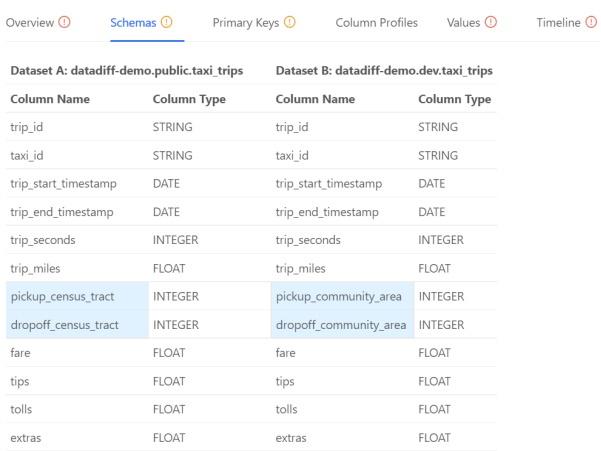
The image above highlights a column with two different datasets. With this, data engineers can focus on just these two areas, saving valuable time.
The data catalog not only lists all data sources registered with Datafold, but also allows users to use filters to find and analyze any particular data set. For organizations with hundreds, or even thousands, of data sets, this is a significant time saver. As a practical method for discovering exceptions, it can help to “answer” the following questions for the data lineage function:
Where does this value come from? How does this value affect other tables? How are these tables related?
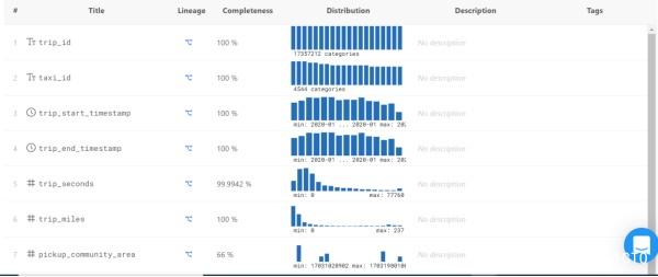
Data Catalog provides the following dashboards. By scrolling the mouse, you can see the details of each column, including:
- Completeness – The percentage of values that are not NULL.
- Distribution–Shows the most and least occurring values, and values that are skewed towards a range.
Click the icon under Lineage, and you will see the following:
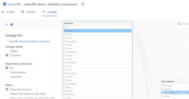
A graphical lineage diagram can help data engineers quickly find the source of column values. You can examine the table, all (or specific) columns, and various lineages related to upstream and downstream.
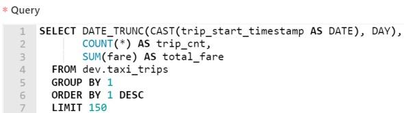
Datafold’s Data Monitoring feature allows data engineers to write SQL commands to find anomalies and create automated alerts. These alerts are powered by machine learning. Machine learning, on the other hand, can accurately detect certain anomalies by studying the trends and periodicities of data. The following diagram shows such a query:
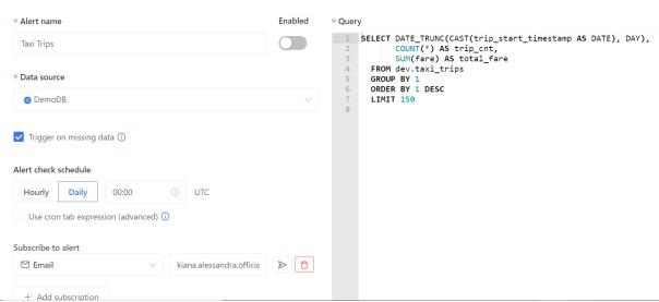
This query is automatically generated by Datafold. It tracks the total daily fare in the taxi dataset, as well as the total number of trips.
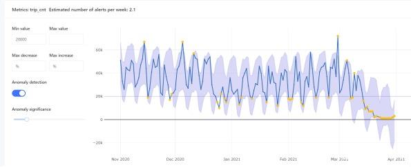
As shown in the figure below, Datafold also allows users to examine the trend of anomalies over time. Among them, the yellow dots indicate various anomalies relative to the minimum and maximum values.
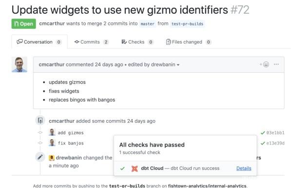
Best Data Quality Tools – 4. Dbt
Dbt is a data transformation workflow tool. It performs data transformation code against the target database before deployment, shows how the code will affect the data, and highlights various potential problems. That is, Dbt constructs the end state of the data by running the SELECT statement based on the logic of the transformation.
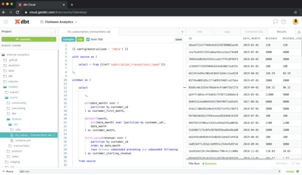
Not only is Dbt easy to integrate into a modern BI stack, but it can be an important part of the CI/CD pipeline. It can both run automatically on pull requests or on a schedule, and has automated rollbacks that prevent potentially breaking code changes during deployment.
It is worth mentioning that Datafold and Dbt can be used together for automated data quality testing. Similar to Dbt, Datafold can also be integrated into CI/CD pipelines. When used together, they show how the object code affects the data.
Best Data Quality Tools – 5. Evidently
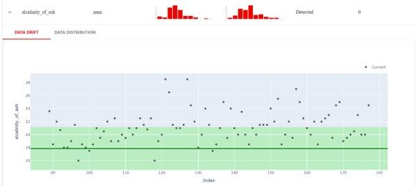
As an open source Python library, Evidently is used to analyze and monitor machine learning models. It can generate interactive reports based on Panda DataFrames and CSV files, which can be used to troubleshoot models and check data integrity. These reports show metrics such as model health, data drift, target drift, data integrity, characterization, and segmentation performance.
To see what Evidently does, you can open a new notebook on Google Colab and copy the following code snippet:

This code snippet generates and loads the report in the browser. The dashboard overview screen of the report will display the distribution of reference and current values based on each function.
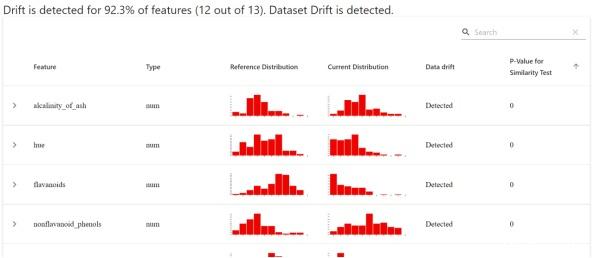
Evidently also allows for more up-close inspections. For example, the image below shows the exact values that differ between the current dataset and the reference dataset.
From this, we can further learn the performance of numerical target drift, classification target drift, regression model performance, classification model performance, and probabilistic classification model.
Conculsion
Thank you for reading our article and we hope you’ve enjoyed it. If you want to learn more about data quality tools, we would like to advise you to visit Gudu SQLFlow for more information.
As one of the best data lineage tools available on the market today, Gudu SQLFlow can not only analyze SQL script files, obtain data lineage, and perform visual display, but also allow users to provide data lineage in CSV format and perform visual display.